Expedia Made to Travel
BRAND REFRESH
ART DIRECTION
CAMPAIGN SYSTEM
Expedia, the traveling agent, wanted to refresh its design system to better connect with travelers, moving beyond traditional, polished imagery and creating a more relatable, experience-driven brand. The new system aimed to position Expedia as a trusted companion that understands and celebrates the journey, not just the destination.
The Challenge
Differentiate Expedia’s design in a saturated market where most travel brands look and feel the same.
The Idea
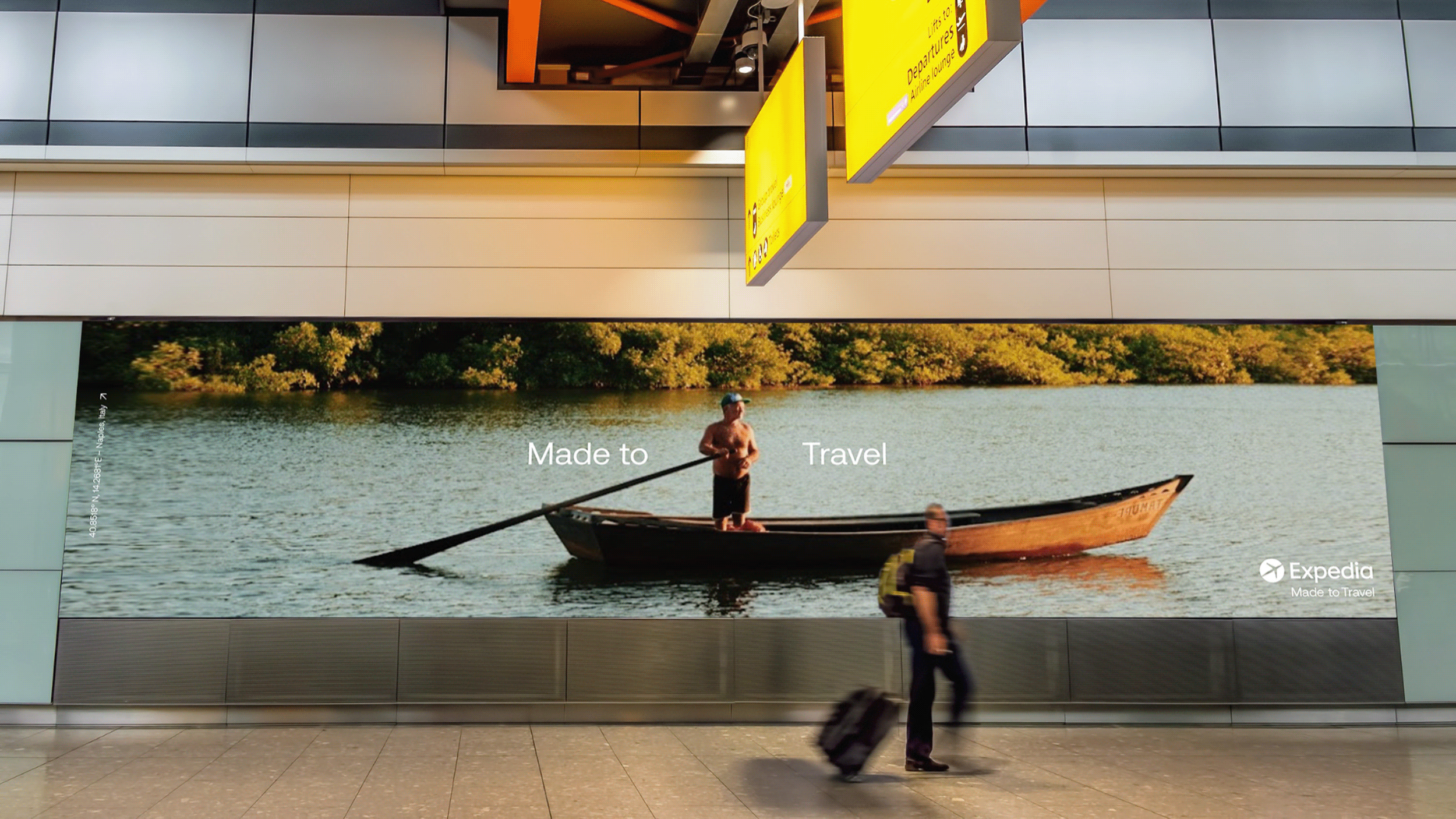
Made to Travel, a brand world built around the unique experiences and perspectives of real travellers.
Inspired by Travel
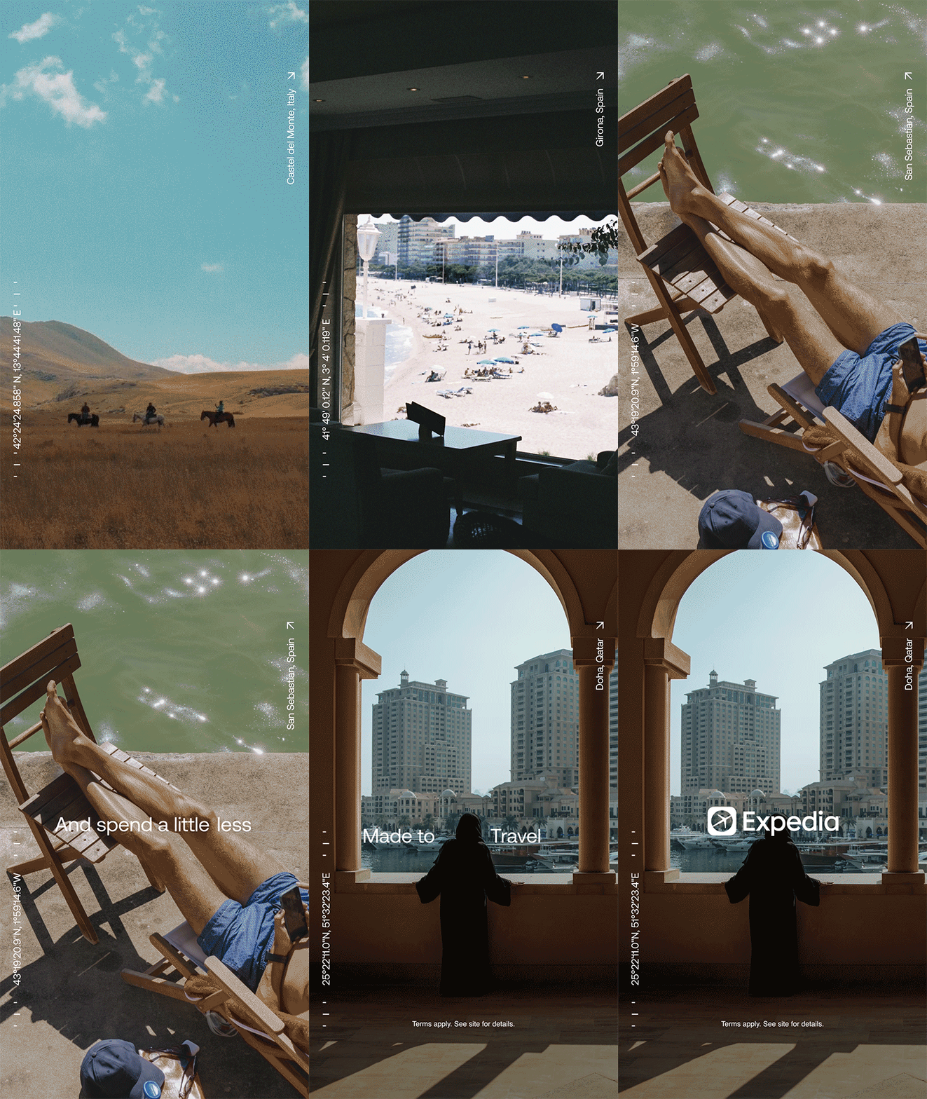
We utilised Aeonik Regular, a clean, modern typeface, paired with a custom set of icons and graphic elements inspired by travel and wayfinding. These elements served to guide users through the interface, echoing the sense of adventure and direction that comes with traveling. The inclusion of directional arrows and coordinates within the layouts provided a tangible sense of place, helping users connect with the locations and experiences depicted.
A Design System that Reflects the Traveler's Experience
Our goal was to create a design system that positioned Expedia as a true companion app, one that celebrates the journey, not just the destination. through research, we learn that consumers felt travel imagery was overly idealized, making the category feel detached from real experiences. People wanted a connection to actual destinations, with a sense of orientation and personal touch. To address this, we included location names and compass coordinates in the design layouts, making each image grounded and relatable.
By embracing real, less polished moments, Expedia’s design system created an authentic, human-centered brand experience.
-
Client: Expedia
Agency: Anomaly
Creative Direction: Jenny Kang, Whitney Ruef
Designer: Jeannie McMahon
Awards: D&AD Shortlisted / The One Club Merit


