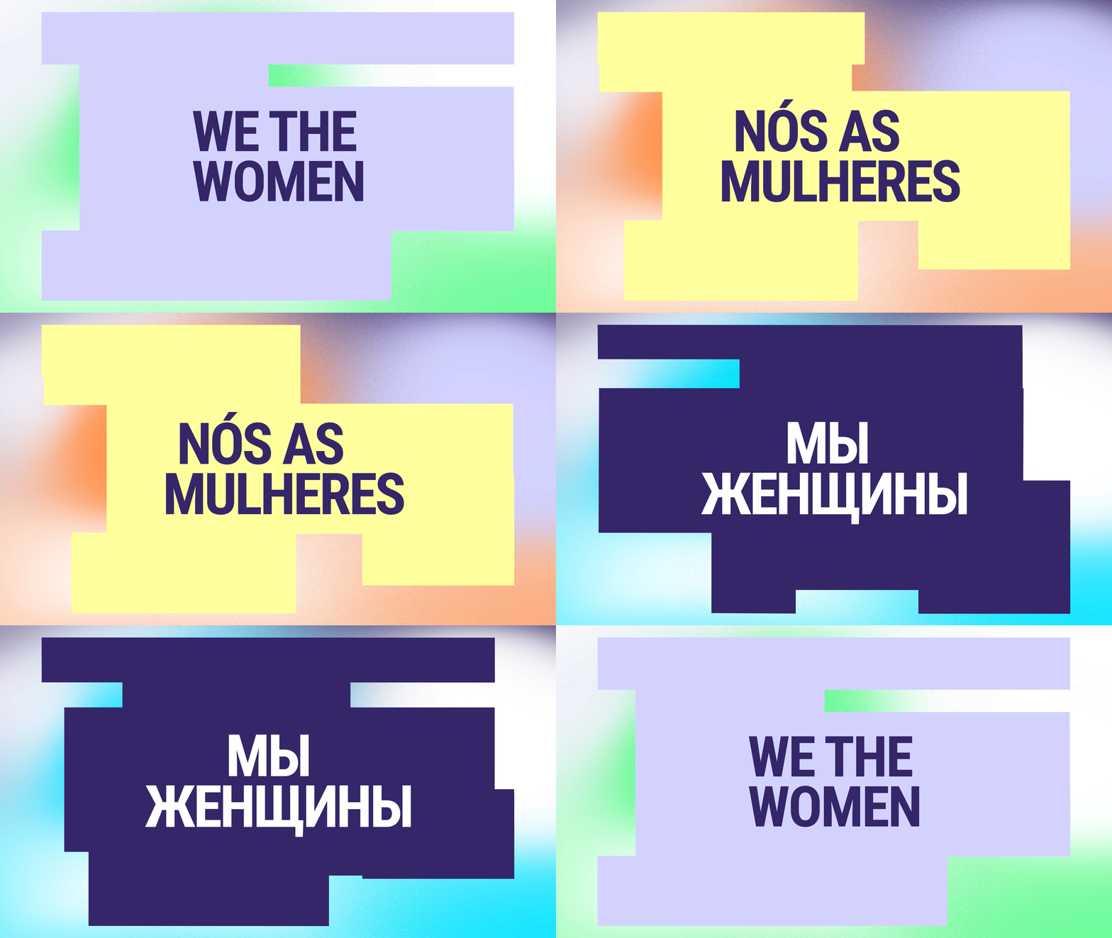
We the Women
Commissioned by the United Nations and Project Everyone UK, We the Women is a global movement empowering women to shape solutions for the world’s most urgent challenges. Designed to bring women’s voices into the heart of the UN’s Sustainable Development Goals (SDGs), this project aims to achieve real-world impact on a global scale.
BRAND STRATEGY
VISUAL IDENTITY
The Challenge
Unite women’s perspectives from around the world and channel them toward actionable change within the SDGs.
The Idea
A global platform that authentically amplifies women’s unique perspectives, leveraging their collective insight to shape meaningful change across key global issues.
An identity build on shifting perceptions
To align with the movement’s mission of shifting perceptions, we developed a brand strategy rooted in inclusivity and optimism. We wanted the brand to emphasize how women’s perspectives are essential to solving the world’s most pressing issues. The strategic goal was to ensure that the brand identity would be a visual metaphor for the diverse and dynamic viewpoints women bring to global challenges, driving home the message that paradigm shifts—rather than incremental change—are necessary for real progress.
The visual identity was extended across digital platforms, ensuring the brand's message was consistent and impactful on social media channels. The flexible design system allowed for easy adaptation across a variety of media while maintaining a unified brand experience
Leveraging Colours to express change
We designed a brand identity centered around a gradient—a powerful visual metaphor representing the multiplicity of women’s insights and the evolving nature of their contributions. The gradient symbolized that there is no singular way of seeing the world, mirroring the diverse solutions women propose to global challenges.
We selected a hopeful and optimistic color palette, inspired by the positive survey results from women worldwide. These colors were meant to inspire action and align with the initiative's vision of a future shaped by empowered women’s leadership.
-
Clients: United Nations and Project Everyone
Agency: Accenture Song
Creative Direction: Camille Yin
Design: CJ Brown, Rosanna Gnocchi
Creatives: Meigan Brown, Tobias Owen
Conveying Movement and Change
The typography within the We the Women identity is deliberately kinetic, embodying motion and evolution to reflect the dynamic role of women in shaping the future. By adding continuous movement to the type, we visually captured the idea that women’s contributions are always progressing and influencing change. This animation effect emphasizes adaptability and underscores the campaign’s forward-looking focus on driving global impact through women’s leadership.
Kinetic typography infuses the brand with energy and evolution, aligning with the project’s purpose of championing progress and lasting impact.


